Let me share a quick story that shows how important a call to action is for both businesses and users alike.
Recently, I visited a super store for some quick shopping. My kids bought fresh juices, while I picked up a sandwich.
Could not locate an express checkout counter. Feeling frustrated, I asked super store’s support staff for direction towards the express counter.
Point? They missed the trick.
They should have put up a clear call to action for people to easily march towards their respective checkout counters.
I needed a call to action.
This post includes what is a call to action, why users need a call to action and how you can write a perfect one with examples.
What is a call to action in web design
A call to action is a button or message that entices users to respond in someway.
For example, a call to action button that says “Buy Now” will lead you to a checkout page, whereas the button that says “Learn More” will land you deeper into the website. Both of these examples form a call to action.
Smart website owners, like yourself, understand the importance of calls to action.
A call to action is a sales tool, however, it also benefits the website owner.
But, more than that, it’s a user experience tool, because it also helps the user. My super story above shows that when you don’t put a call to action, you are bound to frustrate the user.
Why users need a call to action
A call to action helps users navigate through the funnel. In web design, it is mandatory for us to make every effort to simplify the website for our users.
Instead of telling them, show them the direction.
It’s your web design company’s responsibility to make things simple, sweet, easy, and persuasive at the same time.
If a user lands on your product page, consumes the content, like your product, and you want her to scroll back up to click on the Buy Now button, it means a bottle neck exists.
Instead, a sticky “Buy Now” button would be a great conversion-friendly move.
Consider calls to action as your primary tracking tool, a tool that allows you to measure your website’s performance.
And when you combine calls to action with Facebook pixels, it’s a powerful combination, you get to retarget people who interacted with a call to action, but never bought your products.
It’s that powerful. You can group such an audience and show them ads or offers, and I assure you, they are more likely to convert than new visitors.
Busting the Myth: Calls to action only apply to ecommerce websites
Absolutely not true.
Calls to action take many forms. Including but not limited to:
- Sign up forms
- Download links
- Vouchers
- Discount codes
- Email links
- Contact forms
- Checkout processes
- OTP subscription
I can go on and on. Calls to action can be transactional. Every page, blog posts, service page must have a clear call to action.
Site wide call to action in web design
This one is super important. It has to be tied to your primary goal. Be it lead generation, product sales or newsletter subscription.
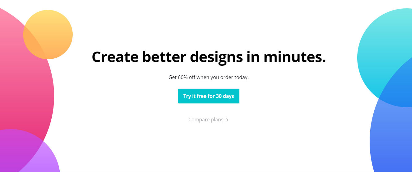
For example, if you run a design downloadables business, your call to action could be a broader one that entices your visitors to purchase straight after reading that call to action message.
“Create better designs in minutes. Get 60% off when you order today.”
The call to action framework for content writers
Using this framework, content writers will have a clear understanding about your goals for that piece of content.
First of all, you must give insights to your writers, so that they can write according to your set objectives.
- Who is the page aimed at?
- What is the main message the page should communicate?
- What will the user learn on this page?
- What next step should the user take?
This last question is extremely important. It’s going to help your business goals and assist users to understand what actions they can take next.
How to pick the right words for calls to action
There was a child who was playing his favorite PlayStation game. Out of nowhere his mom asked him to get a pack of yogurt from the mart.
Disappointed with the situation, he denied. His mom offered him an incentive, told him, “Son, get yourself a few Bonbon Bars, too.”
The truth is that you cannot make somebody to do something they don’t want to do. However, a nudge in the right direction would make things work.
This is what his mom did. She offered a carrot but wielded a stick. As a result, her son had all the motivation in the world to perform the action.
- Words matter. If used correctly, they would entice readers to take action. Hint: emotions win.
- Benefits work versus that of features.
- Address concerns, bottle necks and risks of the readers
- Use the power of peer pressure and social signals.
How to make a perfect call to action
Let me share a few suggestions that would make it easier for you to write a call to action:
- Use active words: Active verbs such as Try, Turn, Grow, Increase, Transform, Create are more likely to persuade users to take action.
- The magic of “New” and “Free”: Research has shown that there is enormous value for marketers in these two words: New and Free.When you introduce something new, it adds to the curiosity and people would be tempted to try it out. Think of a newly launched shake from BaskinRobbins, would you not want to try it? I bet, you would.Similarly, the word “Free” eliminates risk. People want something for nothing. For example: “Create better designs in minutes. Try it free for 30 days.”
- The power of personalization: When you personalize calls to action with “you” or “your”, this allows users to imagine themselves. For example: “Turn your under-performing website to a lead-generating machine.”
- Bonus: Users will be tempted to complete a call to action when you tie a bonus. Perhaps a discount code, a free t-shirt or may be a chance to win a hamper.
- Make it limited in availability: Yes, make it precious. Not easy to get hold of. Example: “Only 10 seats available.”
Another example: “Only 8 hours left to join the program. 20% discount.”
You can blend them both. For example: “Only 10 seats available at a 20% discount and this offer ends in 8 hours.”
Call to action examples
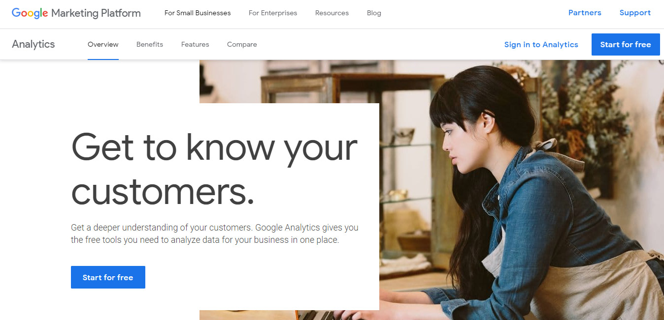
1- Google Analytics
Call to action: Start for Free
Get to know your customers.
Brilliant, isn’t it? Who would not want to know their customers? Tempting to the core for business owners, web designers and marketers alike.
The blue color of the main and secondary call to action button is consistent. Goes well with the page.
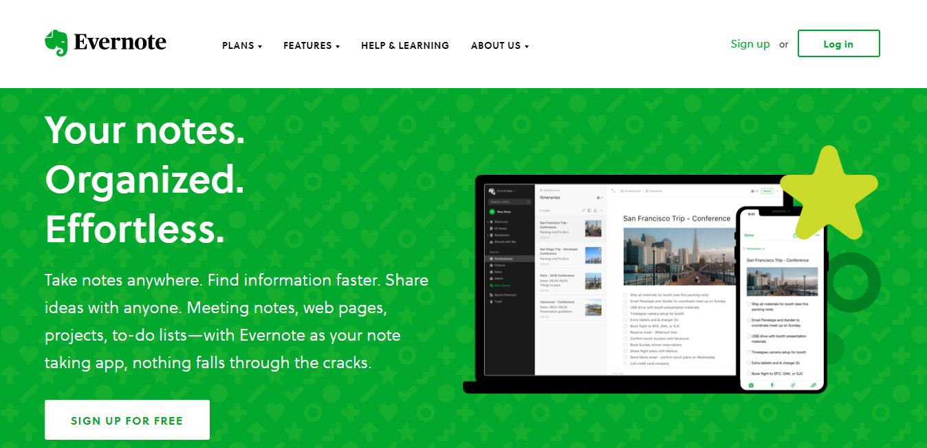
2- Evernote
Call to action: Sign Up for Free
Evernote made it super easy for users to understand what their app is all about. They have used contrasting colors brilliantly. Instead of picking any other color, they used white for the main call to action button.
3- Apple
Call to action: Buy and Learn more
Pro cameras. Pro display. Pro performance.
They know why users visit their website. Without wasting any real estate, they have shown their latest iPhone upfront.
Even though they have not used buttons, still, those 2 blue links stand out.

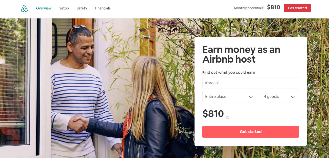
4- Airbnb
Call to action: Get started
Earn money as an Airbnb host.
Show me where the money is and I will be your friend.
They highlighted the monthly potential. Tempting users to click on the magical “Get started” button.
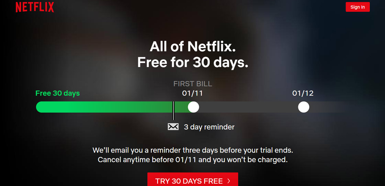
4- Netflix
Call to action: Try 30 Days Free.
All of Netflix. Free for 30 days.
Their headline removes the element of risk. First time users tend to take time to decide on a product.
“Free for 30 days” means you get to experience tons of high-end content without paying a dime.
Plus, they make you comfortable by highlighting that they will send you a reminder, too, in case you want to cancel. Comfortable to the core.
My guess is that this must have boosted their sign up rates, and eventually conversion rates because of the sticky content they serve on their platform.
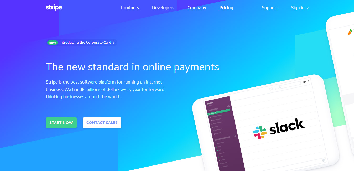
5- Stripe
Call to action: Start Now
The new standard in online payments.
See how they have integrated the word “New” into their headline. If you’ve been using traditional payment gateways to process online payments, this immediately will catch your attention and you’d want to find out what’s new and how they are different.
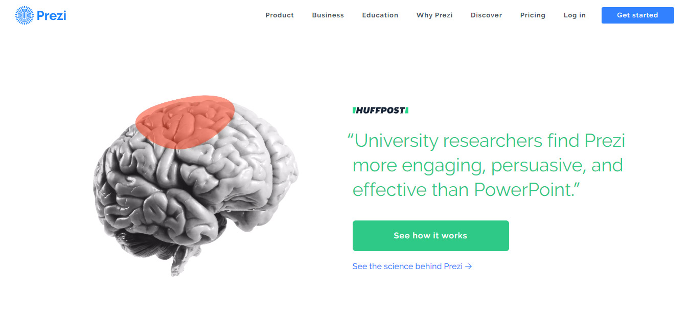
6- Prezi
Call to action: See how it works
Prezi uses the power of social signals to persuade their users to click on the primary call to action button. They have differentiated primary and secondary buttons with unique colors.
The secondary button matches with their logo, therefore, making the mind to click connection.
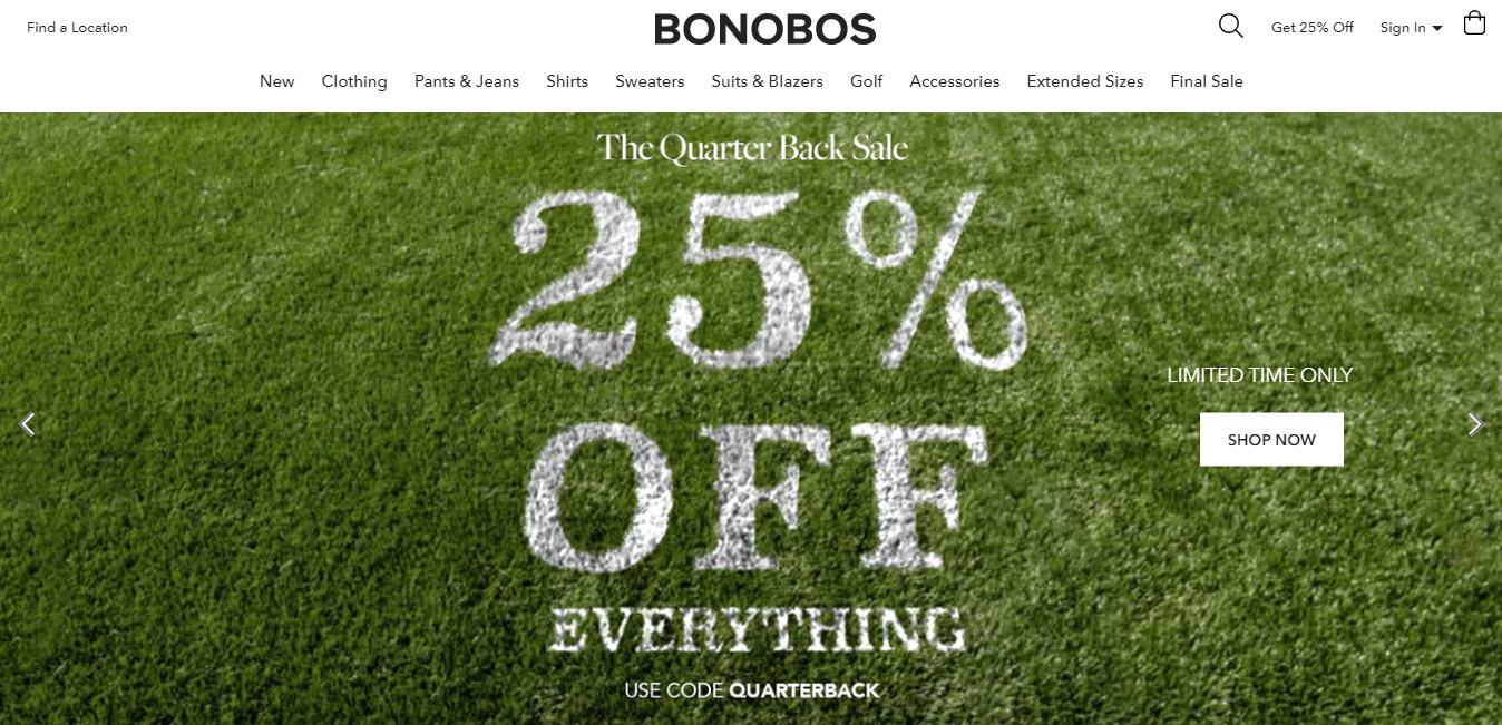
7- Bonobos
Call to action: Shop now
25% off everything. Limited time only.
Bonobos uses the limited in availability factor beautifully. Even passive shoppers would not want to miss this opportunity.
They’ve also mentioned a discount code, which allows them to track the effectiveness of their marketing message.
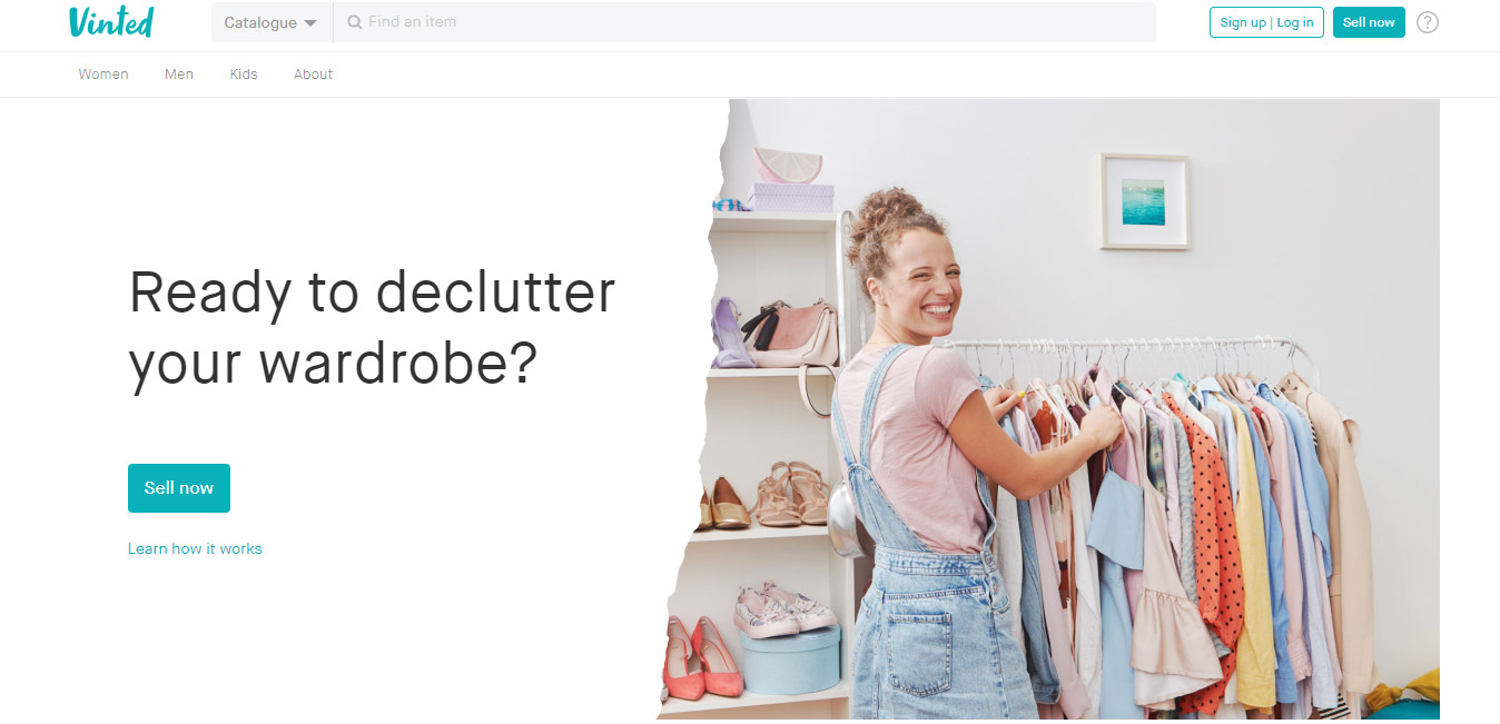
8- Vinted
Call to action: Sell now
Read to declutter your wardrobe?
Vinted prompted users with a question if they want to monetize their wardrobe?
This means there’s a possibility of extracting dollars from clothes you don’t want anymore for whatsoever reason.
They have also used the personalization factor.
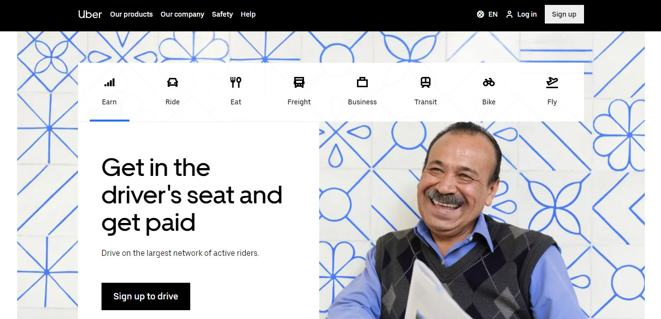
9- Uber
Call to action: Sign up to drive
Get in the driver’s seat and get paid.
Uber’s first screen targets drivers who are looking to monetize. Their core message is straight forward: Start earning by driving around the city.
They have used contrasting colors. The black call-to-action button stands out well on a white background.
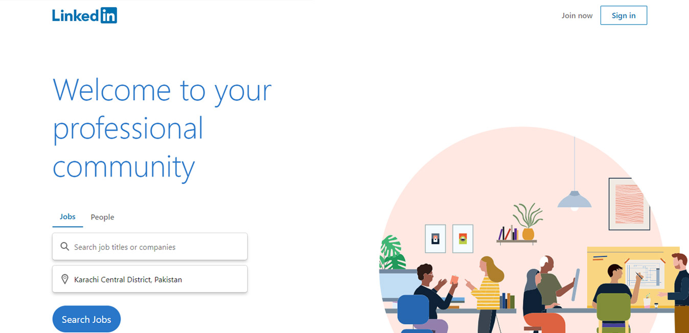
10- Linkedin
Call to action: Search jobs
Welcome to your professional community.
Linkedin used the power of personalization. The word “you” instantly allows their users to frame themselves inside the Linkedin network.
They have made “Search jobs” prominent, while the secondary call to action “Sign in” has an outlined design, making it a button but not prominent enough.
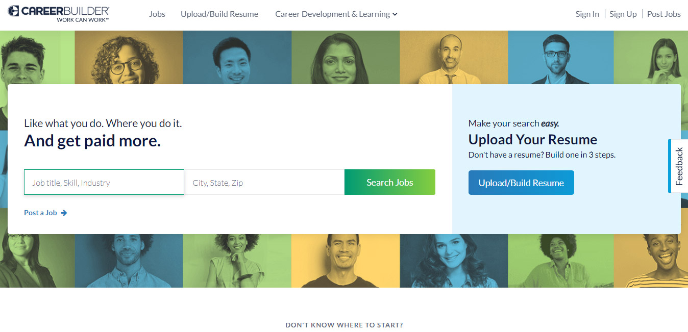
11- CareerBuilder
Call to action: Search jobs
Get paid more. Make your search easy.
They’ve split the above fold area into two sections. Both sections have a correlation, and this is why they are placed together.
Anyone who’s convinced that CareerBuilder is their go-to-platform for job hunting, will have a clear direction where to go to upload their resume.
They have also tried to make it somewhat easier for employers to post a job right from the homepage.
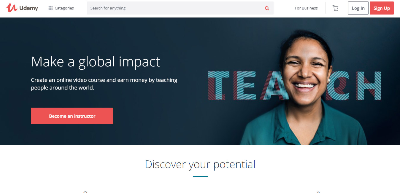
12- Udemy
Call to action: Become an instructor
Make a global impact. Earn money by teaching people around the world.
Make, earn, become — all of these are active verbs.
I have also shared above the importance of using active verbs when writing your CTAs. Udemy does it the same way.
They have kept the header short in height, so that the secondary heading “Discover your potential” is also visible, which instantly makes you want to scroll down for more information.
13- Spotify
Call to action: Get Spotify Free
Millions of songs. No credit card needed.
When you ask credit card upfront, it’s a major turn off. Spotify solved it through this phrase: “No credit card required.”
It’s not just the headline that gives this away; it’s also the coloring of their call to action button. This contrast ensures that visitors are drawn to the call to action.

14- Poshmark
Calls to action: Sign up with Email | Continue with Facebook | Continue with Google
#1 way to buy and sell fashion. The largest social marketplace for fashion.
Poshmark dominates with their core message: You are missing out if you are not on Poshmark.
They have used 3 calls to action, however placed their own on top of the other two, which shows their priorities. However, still don’t want to miss out sign ups that they can get via Facebook and Google.
Both of these sign ups are ultra fast as with just a click, people can signup/login to the platform. Plus, with Facebook, users’ valuable information will also be pulled.

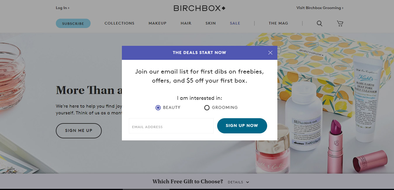
15- Birchbox
Call to action: Sign up now
$5 off your first box.
Birchbox has tied a discount with their sign up process. This $5 discount is comparatively well positioned with their product pricing, which starts at $15/month.
Plus, enticing users to sign up as there will be freebies and offers, too.
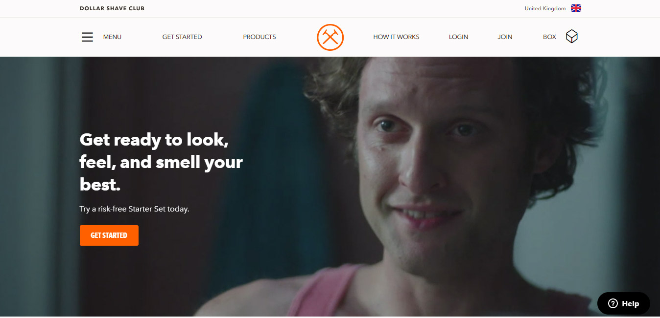
16- Dollar Shave Club
Call to action: Get started
Try a risk free Starter Set today.
For users who are not sure if it’s a good idea to subscribe. They have used an introductory product, which they call a Starter set.
It’s their way of giving you a trial before you subscribe their full pack.
They want you to experience first, and they will up-sell you once you are in. A perfect strategy.