You have to communicate your why, what and how. And your website visitors don’t have much time, because there are tons of other opened tabs on their browsers.
You must get it right, no matter what. Show and tell.
There’s a never-ending list of bad examples in web design. From time to time, one must review their website to ensure design elements are friendly for your website visitors.
Below are some of the mistakes that I hope you are not making. If you do, no worries, from now this guide will help you destroy even the minor traces.
However, if you are short of time, be sure that our web design company can quickly fix your website issues. Talk to an expert today.
1. Sliders

There are thousands of pre-made sliders available online. They are beautiful, but that’s the only thing good about them.
Why sliders are irritating?
Because they make you wait. Their faster rotation makes it harder for visitors to consume the content.
The solution:
Replace the slider with a single image with a well thought, in your visitors’ shoes headline, and you are highly likely to convert your website visitors.
Still want to use a slider?
I get your temptation. Here’s the deal: Use a vertical slider that shows more slides when you scroll down.
2. Show text on hover

Okay. I get it. You want to save the real estate on a web page as much as you can. Trouble is when you keep it too tight and introduce design elements that make your visitors guess.
One such element is the use of hover elements. It’s like playing a hide and seek game. Show when you hover a mouse on the picture and hide when you move your mouse away from that picture.
Now access that same hide and seek game on your mobile. You’ll fail 100% because mobile does not have that hover function.
Do you want your website visitors to hover their heads on their phones? Irritating, right?
The solution:
Straight away leak that important information that you used to hide. It’s like sharing new ideas without being worried about getting copied.
3. Navigation within a page aka Tabs

Tabs make people guess and are an additional click to your favorite piece of content.
Why should your website visitors make an extra effort to view that content?
The solution:
Get rid of tabs whenever you need to create a unified experience. Prefer scrolling versus tabs.
4. No indication about clickable links
Website visitors should never have to devote a millisecond of thought to whether things are clickable – or not.
Most of the times, website owners make this mistake. They put a link to an image and expect people to click on it. How would they know that it’s clickable unless you convert that clickable word into a button or an underline link.
The solution:
Here are some of the examples that work.
- This link will take you to the portfolio.
- You can’t miss our portfolio.
5. Text links within a paragraph

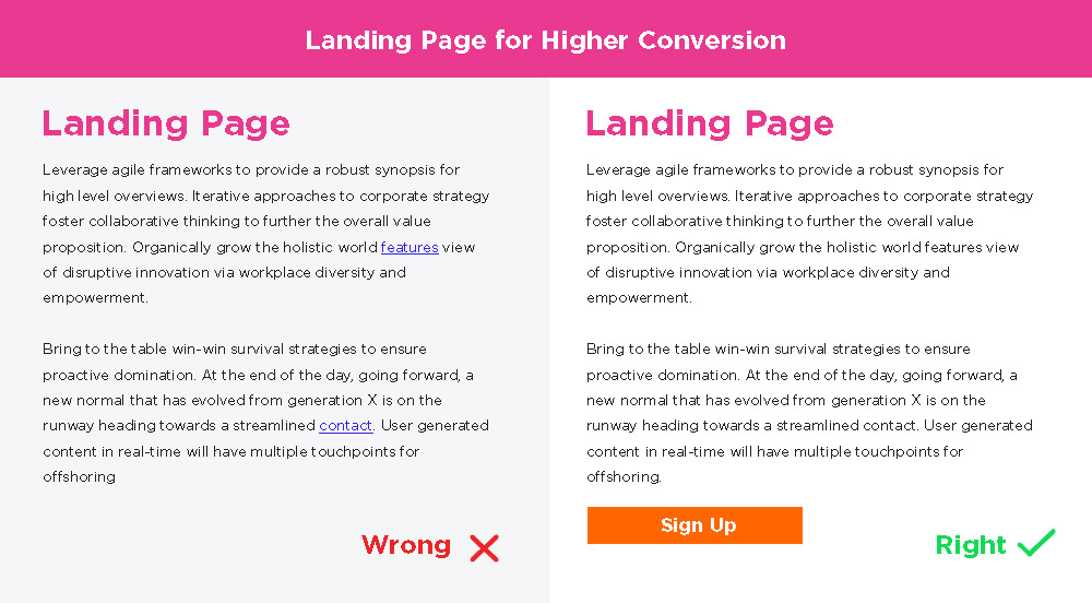
Ah so you’re working on a landing page that promotes your new product. Your copy is sorted. It covers intro, benefits, features, product mockups and testimonials. Brilliant.
You are leading with an intro paragraph having links to features, benefits, testimonials within that paragraph. This is a sure-fire way to lose your visitors’ attention.
Why? Because clicking on such links will take them to a whole new page, and that makes it super difficult for them to take an action that you want them to take.
The solution:
Put all the important information right on that single page. Divide them into sections for easy consumption. And put that HUGE call to action right there.


