Sharing is Caring
Here we share our experiences and thoughts about web strategy, social media marketing, SEO & really anything that strikes our fancy.

What you will see in 2014
01 Apr, 2014
As we wave 2013 goodbye, we watch the old trends and fashion going away. When it comes to technology however, trends and fashion evolve while offering far greater efficiency. So unlike fashion, old technology and platforms are probably never going to be used. The world is shifting to implement more dynamic websites than static websites.
Just last year we witnessed some great designs using sophisticated technology that offered speed and efficiency. Of course one thing about technology is that it upgrades exponentially before one can even blink. Some rookie web designer has maybe gotten his hands on a completely out of the box web template using an upgraded version of HTML5 or is busy patching and upgrading his current software before getting started on a new project.
Slicing problems
One can imagine the huge gap between a front end developer and a graphic designer. Their work platforms are entirely different (front end developers relying more on text editors and designers on tools such as Photoshop). There have been websites that have tried to bridge the gap between two platforms but the solution has not been widely adapted. However more and more front end developers are adapting themselves to new tools such as Dreamweaver rather than sticking to their old methods of designing interfaces. This offers huge modifications in the representation of color theme and schematics. In layman term, front end developers and designers will have more options to improve upon the layout and the web design.
Less images
More and more web design companies rely on the CSS style sheets and use less PNG images on the sites. If not CSS then SVG images will be adopted. This gives an added advantage of fast browsing as PNG images are relatively bigger in size. With many viewers accessing sites through their phones, this can come in handy as style sheets are responsive to different platforms unlike PNG images (one can imagine how awkward and unattractive a picture going out a frame in a smart phone will look).
More and more video oriented designs
They are the next big thing! And they will be everywhere too. A YouTube link will not just be embedded. We will see more and more sites using video oriented representation at the backdrop and header. And what better way to tell tales than show them?
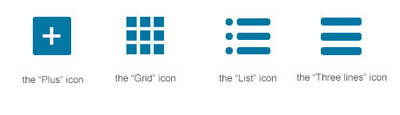
More responsive icons
Responsive websites will spread like wildfire especially now that everyone Instagrams their meals before eating them. More and more viewers want convenience. Hence web design companies will sought after responsive web designs that would be presentable on smart phones. Also thanks to languages like Hammer.js, Zepto.js, etc, neater style sheets can be made. Developers will now have options aside from writing CSS scripts.
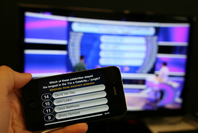
Second screen
This may be another trend more likely to be adopted widely due to smart phones reaching down the lower end of the market. Many viewers can now connect their tablets and smart phones with computers or gaming console to enjoy secondary information.
Publishing content without clutter
Content can now be published without the developer wasting time on its alignment. Content management system in this case comes into play, making the text appear crisp and neat on the webpage.
4M Designers stay abreast of the changing trends in the business world. And definitely a lot of new and brilliant innovations await web designers in 2014. This will indeed be a happy new year at every click!

Established in 2003
4M Designers is a family backed creative digital agency. Our culture is rooted in a deep purpose, solid values, and inspiring philosophy. Our services are focused towards producing outcomes, not outputs. We start with the heart, and always put strategy before execution. We have worked with companies of all sizes. Our work is our footprint. It's our business, our passion, our calling, and our expertise. This is what we do. Let's get started.
Follow @4mdesignersWhat we offer
Number of ways to reach us
Suite No. 119
Techno City Office Tower
Off I.I. Chundrigar Road
Karachi 74000 - Pakistan.
E-mail: contact@4mdesigners.com
Phone (9-5): +92-21-3-221-4110
Phone: +92-321-2323-717
Download our Vcard